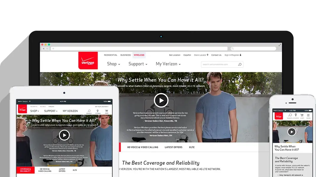
Verizon Wireless
Nearly three years on the internal team that designed verizonwireless.com: launches, campaigns, landing pages, and, eventually, user flows.
At a glance
- Role
- UI / Visual Designer (contract)
- Years
- March 2013 to December 2015
- Team
- Digital Design and Development group (D3G), the internal creative team for verizonwireless.com
- What I owned
- Campaign creative, landing pages, and device launches across Verizon's B2B and B2C businesses, then user flows
Verizon.com never stopped.
Okay, so here's what was going on. Verizon.com ran on a nonstop stream of launches, promos, and fixes, and every one of them needed design on a deadline. I was on the internal creative team that made it happen.
That team was the Digital Design and Development group, D3G, the internal creative team that designed for verizonwireless.com. Requests came from project managers and stakeholders across the business, and I designed for both sides of it: B2C and B2B, across web, advertising, promotional, and product-launch touchpoints.
Over time my work moved from production design, to landing pages, to seasonal campaigns and phone launches, to designing user flows.
Nonstop requests taught me to design fast without lowering the bar.
What the queue looked like.
I kept my own project tracker, and I exported it. It runs October 2013 to June 2015, nearly all of it from January 2014 on. My time at Verizon ran March 2013 to December 2015, so the export doesn't cover all of it.
- 320
- requests I worked through, Oct 2013 to Jun 2015
- 264
- closed or complete
- 1,000+
- final assets: homepage marquees, site search banners, and homepage pods
27 more were cancelled, and the rest were still open when I made the export. The work spans device and accessory launches, prepaid promos, B2B and B2E pages, landing pages, homepage marquees and pods, product detail pages, product image sets and virtual bundles, and UX comps for account and checkout flows.
At that volume, reading the brief before opening a file is what kept the work consistent.
The ones I led.
I was the lead designer on three national initiatives: 4G LTE, Softcard, and Verizon Smart Rewards. The concepts and brand systems were set. My job was to carry them across every digital format without losing consistency, quality, or the production requirements.
4G LTE
The 4G LTE page is the one I'd show first. Drag the handle to compare the page before the redesign with the redesign. Below are the page on desktop, tablet, and phone, and both full pages.
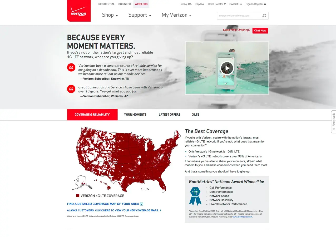
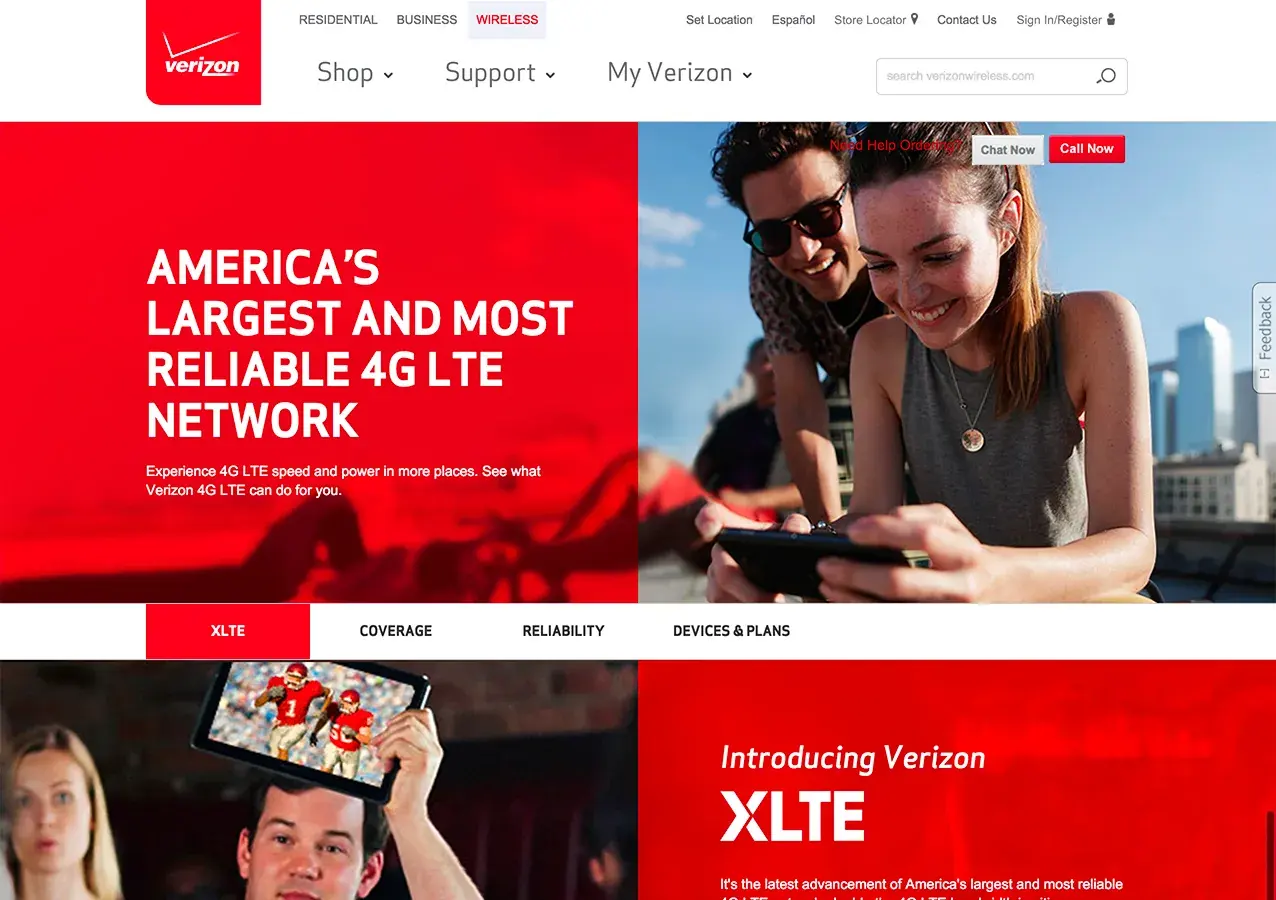
4G LTE page, before and after the redesign. Drag the handle, or use the arrow keys.
Softcard
Softcard was the ISIS rebrand. I designed its launch pages, from what it is, to how it works, to the steps to get started, to the offers and promos.
Verizon Smart Rewards
I was the lead designer on Verizon Smart Rewards, the rewards program. Here's the page, and the landing page that introduced it.
National work means one idea, in every format, held together.
A launch has a date.
A launch page is a shop window with a date on it. I created visual concepts, high-fidelity designs, digital advertising, and landing pages for device launches across Apple, LG, Motorola, Nokia, and Samsung. These are the ones I can show.
Galaxy Tab S
A homepage marquee, a business homepage marquee, a business landing page, and the page on a laptop.
BlackBerry
The Q10 product page and the business pages for the Q10 and Z10.
Android Wear
A landing page for Motorola and Sony smartwatches, on desktop and phone.
A launch date doesn't move, so the design has to be ready when it arrives.
Cases, speakers, and seasonal promos.
Accessories were a steady stream of campaign work: product launches like LifeProof, seasonal pushes like Mother's Day, and the accessories pages themselves. The job was to make a page full of small products feel easy to shop.
On a page full of small products, hierarchy is the whole job.
Prepaid, business, and apps.
Not every request is a launch. Prepaid promos, app pages, and business pages ran alongside the big work, and they needed the same attention.
The unglamorous pages got the same care as the launches, because customers use them every day.
Two brands, one landing page.
I worked directly with Google's marketing team to build landing pages that worked with both brands. Here's a taste.
Two brands share a page well when each one stays easy to recognize.
Many partners, one brand.
I worked across internal teams, project managers, and stakeholders, and with external brand and agency partners including Apple, Google, AKQA, McGarryBowen, Moxie, and Rauxa. My job was to keep the brand looking like one voice across every campaign execution: adapting established brand systems and campaign concepts across digital formats while holding consistency, quality, and production requirements. I also made sure agency assets matched Verizon's brand and reached the right development team for launch.
Keeping every partner's work looking like one Verizon was the job.
Defend the decision. Pick the battle.
Verizon taught me to work with a lot of different people at every level, and every one of them had an opinion about how something should look. I learned to defend my design decisions out loud and back them up with a reason, not a preference. I also learned to communicate clearly with project managers, stakeholders, and agency partners, even when they wanted three different things.
The lesson that took me longest to get right was knowing which battles are worth having. If the feedback is about taste and saying yes costs the business nothing, I say yes and keep things moving. If it affects clarity, the brand, legal copy, or whether the page works for the customer, I hold the line and explain why. Same designer, different answer, because the stakes are different.
The short version: I'll give you the headline color. I won't give you a confusing page.
Work shown was created for Verizon Wireless. Verizon and related marks belong to Verizon.